FORKNI-L
Digest - 16 Apr 2012 to 17 Apr 2012 (#2012-59)
Tue, 17 Apr 2012
There are 7 messages totalling 215 lines in this issue.
Topics of the day:
1. Faction icons (3)
2. Faction icon for the Ravenettes (3)
3. Faction for Spark
----------------------------------------------------------------------
Date: Mon, 16 Apr 2012 15:39:14 -0700
From: Andrew Caruthers <slinter@j.......>
Subject: Re: Faction icons
OUCH!!!!!!!!!!!!!
On Mon, 16 Apr 2012 04:30:44 -0700 Walt Doherty <wdoherty5@c.......>
writes:
> Or better yet (or possibly, worse yet) a faction for Spark would
> be called, "The Plugs".
>
> W
>
> ----- Original Message -----
> From: "Andrew Caruthers" <slinter@j.......>
>
> > If there had been a Spark Faction, would it have been called "The
> > Sparkettes"?
> > Okay, me bad.
>
>
------------------------------
Date: Mon, 16 Apr 2012 16:04:08 -0700
From: Janice Cox <janicecox1@l.......>
Subject: Re: Faction icons
Yeah that one hurt right between the eyes.
Janice
________________________________
From: Andrew Caruthers
Sent: 4/16/2012 3:45 PM
To: FORKNI-L@l.......
Subject: Re: Faction icons
OUCH!!!!!!!!!!!!!
On Mon, 16 Apr 2012 04:30:44 -0700 Walt Doherty <wdoherty5@c.......>
writes:
> Or better yet (or possibly, worse yet) a faction for Spark would
> be called, "The Plugs".
>
> W
>
> ----- Original Message -----
> From: "Andrew Caruthers" <slinter@j.......>
>
> > If there had been a Spark Faction, would it have been called "The
> > Sparkettes"?
> > Okay, me bad.
>
>
------------------------------
Date: Mon, 16 Apr 2012 17:02:47 -0700
From: Liz the Lucky <lizthelucky@c.......>
Subject: Re: Faction icons
> Yeah that one hurt right between the eyes.
It was better than my idea. Which was Sparklers. {Insert images of certain
non-FK vamps.} g,d,rlhhhhhhhhhhhhhhhhhhhhhhhh
Hugs and Kisses,
Liz the Lucky
lizthelucky@c.......
twitter.com/lizthelucky
Merc House Mommie
------------------------------
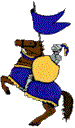
Date: Tue, 17 Apr 2012 00:23:53 +1000
From: Alexander Braun <ajbraun55@g.......>
Subject: Re: Faction icon for the Ravenettes
> Yowza...that's putting it mildly...and leads me to ask a question.
> Is a larger version of these pictures a possibility?
>
I would also would like a larger version of these icon pictures if it can
be done.
Alex
------------------------------
Date: Tue, 17 Apr 2012 09:19:20 -0400
From: Greer Watson <gwatson2@r.......>
Subject: Re: Faction icon for the Ravenettes
On Mon, 16 Apr 2012, Tim said:
> Is a larger version of these pictures a possibility?
> Some of these are such works of art I just want to see more...
It depends on the picture. In some cases the constituents are fairly high
resolution, and it would therefore be possible to make a version at least
300px square (i.e. nine times the area). In other cases, maybe a 200px
version is possible. However, there are a few that simply couldn't be
enlarged. (The Mikies icon is an example: I had to use a very small
picture of Miklos in order to get one with natural flesh tones.)
What you may not realize, though, is that--in some instances, not
all--changes would have to be made, usually to the logo and/or border. Of
course, that's not impossible to do, just a bit time-consuming.
You see, in order for such a tiny logo to be legible, it's necessary to trim
round the edges with a contrasting colour so that the JPEGing doesn make the
letters bleed into the background. However, the trim is not always
compatible with the other colours in the icon. Take the Ravenettes icon: I
just had to redo the outline from cream to tan to improve the legibility.
However, when you see the icon larger, you can see the tan outline quite
clearly--and it doesn't fit with the colour scheme. (Of course, in that
case there's no problem, since I still have the cream-edged version.)
Which icons were you interested in seeing larger?
Greer
gwatson2@r.......
http://www.foreverknight.org/FK4/
------------------------------
Date: Tue, 17 Apr 2012 09:24:08 -0400
From: Greer Watson <gwatson2@r.......>
Subject: Faction for Spark
Let me toss "Sparklers" into the ring.
From Andrew:
> If there had been a Spark Faction, would it have been called "The
> Sparkettes"?
From Walt:
> Or better yet (or possibly, worse yet) a faction for Spark would
> be called, "The Plugs".
Greer
gwatson2@r.......
http://www.foreverknight.org/FK4/
------------------------------
Date: Tue, 17 Apr 2012 09:45:40 -0400
From: "Phillips, Tim" <Tim.Phillips@s.......>
Subject: Re: Faction icon for the Ravenettes
>It depends on the picture. In some cases the constituents are fairly high
>resolution, and it would therefore be possible to make a version at least 300px
>square (i.e. nine times the area). In other cases, maybe a 200px version is
>possible. However, there are a few that simply couldn't be enlarged.
>(The Mikies icon is an example: I had to use a very small picture of Miklos
>in order to get one with natural flesh tones.)
Yes. From reading your write-ups with each icon...it is clear that a
"pile 'o crowbar work" was necessary on some of them.
>What you may not realize, though, is that--in some instances, not all--changes
>would have to be made, usually to the logo and/or border. Of course,
>That's not impossible to do, just a bit time-consuming.
A long time ago, I created a couple of FK icons just so I could put Saint
Natalie - the patron-saint of my little software development effort - on some
of my software. Didn't take long to realize how much of an art it is to get
something that small to look half-decent...to say nothing of making something
that looked really good at "postage stamp" size.
> Which icons were you interested in seeing larger?
Well, the Ravenettes for sure, because it finally got me to ask.
Dark Perks
Nick And NatPack
Mmmm...just a thought...would it make more sense/be more fun for you to not
rework icons...but rather finish with the icons and the move on to a line of FK
faction wallpapers? You might be more pleased with the end-results as you
wouldn't be starting from the limitations of the smaller scale of an icon?
Just a thought.
Thank you again for what you've done to date
:-)
Tim
------------------------------
End of FORKNI-L Digest - 16 Apr 2012 to 17 Apr 2012 (#2012-59)
**************************************************************
Knight graphics and parchment background created by Melissa Snell and may be found at http://historymedren.about.com/